|
|
Home >
Multimedia >
Graphics
Graphics
 | The IBEX team has created a revised image based on the recent IBEX discovery of the lack of a bow shock in front of our heliosphere. Information about this is available on our May 2012 Archived Update.
Image Credit: IBEX Team/Adler Planetarium |
 | This image is the first-ever composite image of the plasma sheet in the Earth's magnetotail. Earth is shown by the black/white circle in the middle. The curved lines represent model magnetic field lines in the Earth's magnetosphere. The Sun is toward the left. The red and yellow colors show the regions of the magnetosphere emitting the most energetic neutral atoms (ENAs), and the green, blue, and purple colors show the regions emitting fewer ENAs. Ths image represents the ENAs collected by IBEX in Orbit 52, from November 5 through 7, 2009. The line next to FOV in the lower right corner shows the width of IBEX's field of view at any one time. To build up this image, IBEX had to scan the magnetosphere for about two days. It is important to note that this ENA image is not a snapshot but, instead, it is an average of the ENAs detected over the course of about two days.
Image Credit: NASA/IBEX Science Team |
This is the second set of solar system boundary maps released by the IBEX team in September 2010. Each shows a range of energetic neutral atom (ENA) energies, using data collected over the course of six months. In each map, red indicates the highest number of ENAs measured by the spacecraft. Yellow and green indicate lower numbers of ENAs, and blue and purple show the lowest number of ENAs detected by IBEX. There is an arc–shaped region in the sky that is creating a large amount of ENAs, showing up as a bright, narrow ribbon on the maps. The maps on the left represent the first six months of ENAs that the IBEX spacecraft collected between December 25, 2008 and June 18, 2009. The maps on the right represent the second six months of ENAs that the IBEX spacecraft collected between June 18, 2009 and December 10, 2009. The large–scale structure is generally stable between the two sets of maps, meaning the overall sky pattern of ENAs and the ribbon are still present, though the IBEX team noted some remarkable changes that show that the region producing the ribbon evolved over this short six–month timescale.
Image Credit: SwRI/IBEX Team
This is the first set of solar system boundary maps released by the IBEX team in October 2009. Each of the maps above shows a range of energetic neutral atom (ENA) energies, using data collected over the course of six months. Yellow and green indicate lower numbers of ENAs, and blue and purple show the lowest number of ENAs detected by IBEX. There is an arc–shaped region in the sky that is creating a large amount of ENAs, showing up as a bright, narrow ribbon on the maps. Although the scientists knew the real data would not look exactly as their models predicted, this ribbon feature was a huge surprise to the scientists and was not predicted by any existing models. The ribbon appears to be produced by the alignment of magnetic fields outside our heliosphere. These observations suggest that the interstellar environment has far more influence on structuring the heliosphere than anyone previously believed.
Image Credit: McComas, et al, and Science
| This image is the first-ever composite image of the plasma sheet in the Earth's magnetotail. Earth is shown by the black/white circle in the middle. The curved lines represent model magnetic field lines in the Earth's magnetosphere. The Sun is toward the left. The red and yellow colors show the regions of the magnetosphere emitting the most energetic neutral atoms (ENAs), and the green, blue, and purple colors show the regions emitting fewer ENAs. Ths image represents the ENAs collected by IBEX in Orbit 52, from November 5 through 7, 2009. The line next to FOV in the lower right corner shows the width of IBEX's field of view at any one time. To build up this image, IBEX had to scan the magnetosphere for about two days. It is important to note that this ENA image is not a snapshot but, instead, it is an average of the ENAs detected over the course of about two days.
Image Credit: NASA/IBEX Science Team |
 | This is IBEX’s second composite image of the plasma sheet in the Earth’s magnetotail. Earth is shown by the black/white circle in the middle. The curved lines represent model magnetic field lines in the Earth's magnetosphere. The Sun is toward the left. The red and yellow colors show the regions of the magnetosphere emitting the most energetic neutral atoms (ENAs), and the green, blue, and purple colors show the regions emitting fewer ENAs. There are more ENAs that can be seen in the most distant part of the plasma sheet to the far right, and fewer ENAs are seen in nearer plasma sheet region compared to the previous ENA image. Such a brightening would be consistent with dynamic changes in the magnetotail. These changes occur frequently. These observations were made from October 27 through October 29, 2009, and this map was created from observations built up from many scans of the magnetosphere during that time. It is important to note that this ENA image is not a snapshot but, instead, it is an average of the ENAs detected over the course of about two days.
Image Credit: NASA/IBEX Science Team |
 | At higher energies in the first set of heliosphere maps, the IBEX team saw a bright "knot" of energetic neutral atoms (ENAs) in the upper left (northern) portion of the ribbon. This map cutout at the top shows the knot region from the first set of maps, and the middle one shows the same region in the second set of maps. Red, orange, and yellow colors indicate regions emitting higher numbers of ENAs; green and blue colors indicate lower numbers of ENAs. In the middle cutout, the much smaller bulge of red and the greater use of yellows and greens in the map tells the science team that the knot area emitted fewer ENAs during the time period of the second set of maps. The knot seems to have spread out a bit, as well. The red outline has been added to highlight this area.
Image Credit: McComas, et al. (2010), Journal of Geophysical Research |
 | As the solar wind streams outward from the Sun, the solar wind protons and electrons pile up along the outer boundary of Earth’s magnetosphere, called the "magnetopause". These charged particles are shocked, heated, and slowed almost to a stop before getting diverted sideways. A few of those charged particles interact with neutral atoms in the very outer reaches of our atmosphere. The solar wind charged particles exchange electrons with our exosphere’s neutral particles, and the solar wind particles become neutral in the process (energetic neutral atoms, or ENAs). The area where the exosphere and solar wind interact most heavily produces the most ENAs. This new IBEX map shows the ENAs that are created due to interaction between the solar wind and Earth’s magnetosphere. The ENAs are created in greater numbers at the magnetosphere boundary in the direction pointing toward the Sun (to the right, well off the edge of this map) and thin out at locations away from this point. Earth is shown by the black/white circle to the left. The lines that curve around the Earth represent model magnetic field lines in the Earth's magnetosphere. Red and yellow colors in the map above show areas with the most ENAs; green and blue colors show areas with the least ENAs. These key observations were made in March and April 2009 when IBEX’s detectors could scan the region directly in front of the magnetopause.
Image Copyright: American Geophysical Union;
Image Credit: IBEX Team |
 |
This is an artist’s representation of Earth’s magnetosphere. Earth is represented near the middle. The lines around the Earth are model magnetic field lines in Earth’s magnetosphere. The blue fuzzy area around the Earth represents Earth’s exosphere. Our Sun is well off of the edge of the drawing to the left. The pink area in front of Earth’s magnetopause is the region where IBEX has detected energetic neutral atoms. As the solar wind streams outward from the Sun at a million miles per hour (1.6 million kilometers per hour), the solar wind protons and electrons pile up along the outer boundary of Earth’s magnetosphere, called the "magnetopause". These charged particles are shocked, heated, and slowed almost to a stop before getting diverted sideways. A few of those charged particles interact with neutral atoms in the very outer reaches of our atmosphere about 35,000 miles (56,000 kilometers) from the surface of the Earth. This extremely low–density region of our atmosphere, called the "exosphere", extends beyond Earth’s protective magnetic field. The solar wind charged particles exchange electrons with our exosphere’s neutral particles, and the solar wind particles become neutral in the process. Now, they are no longer affected by Earth’s magnetic field and fly off in whatever direction they were going when they became neutral. Because some of these particles happen to be traveling in the direction of the IBEX spacecraft and its sensors, IBEX can detect them. Just like our heliosphere boundary, our magnetosphere boundary does not give off light that we can detect, so we must use particle sensors like those of IBEX to study regions like this. IBEX detected ENAs from this process in March and April 2009.
Image Credit: NASA/Goddard Space Flight Center |
 |
Each of the first solar system boundary maps released by the IBEX team in October 2009 shows a range of ENA energies, using data collected over the course of six months. In each map, red indicates the highest number of ENAs measured by the spacecraft. Yellow and green indicate lower numbers of ENAs, and blue and purple show the lowest number of ENAs detected by IBEX. There is an arc–shaped region in the sky that is creating a large amount of ENAs, showing up as a bright, narrow ribbon on the maps. As shown in this image, an even closer look at segments of the ribbon shows fine details, which suggests that the numbers of ENAs may be significantly enhanced in highly localized regions at the interstellar boundary.
Image Credit: McComas, et al, and Science |
 |
IBEX has made the first direct observations of interstellar neutral atoms–hydrogen and oxygen atoms drifting in from the interstellar medium outside of our heliosphere. In each map, red indicates the highest number of energetic neutral atoms (ENAs) measured by the spacecraft. Yellow and green indicate lower numbers of ENAs, and blue and purple show the lowest number of ENAs detected by IBEX. The localization of red and yellow in this image shows the hydrogen (top image) and oxygen (bottom image) detected by IBEX. This image was released in October 2009.
Image Credit: McComas, et al, and Science |
 |
Interstellar Boundary Explorer (IBEX) Logo.
Image Credit: SwRI |
 |
This is a picture of the local stellar neighborhood, which includes our Sun and the closest stars. The red dot near the center of the picture is the heliosphere. The heliosphere is a bubble created by the solar wind. The heliosphere lies in a cloud of gaseous material that is mostly made of Hydrogen. This gaseous material is called the interstellar medium (ISM). This ISM is present throughout the galaxy and moves constantly. However, the Sun, and therefore the heliosphere, does not always move in the same direction as the Hydrogen gas. The movement of the heliosphere in the ISM creates a wake, much like that of a boat in water, as shown in the insert. (This image is not to scale.)
Image Credit: R. Casalegno, C. Conselice et al., WIYN, NOAO |
 |
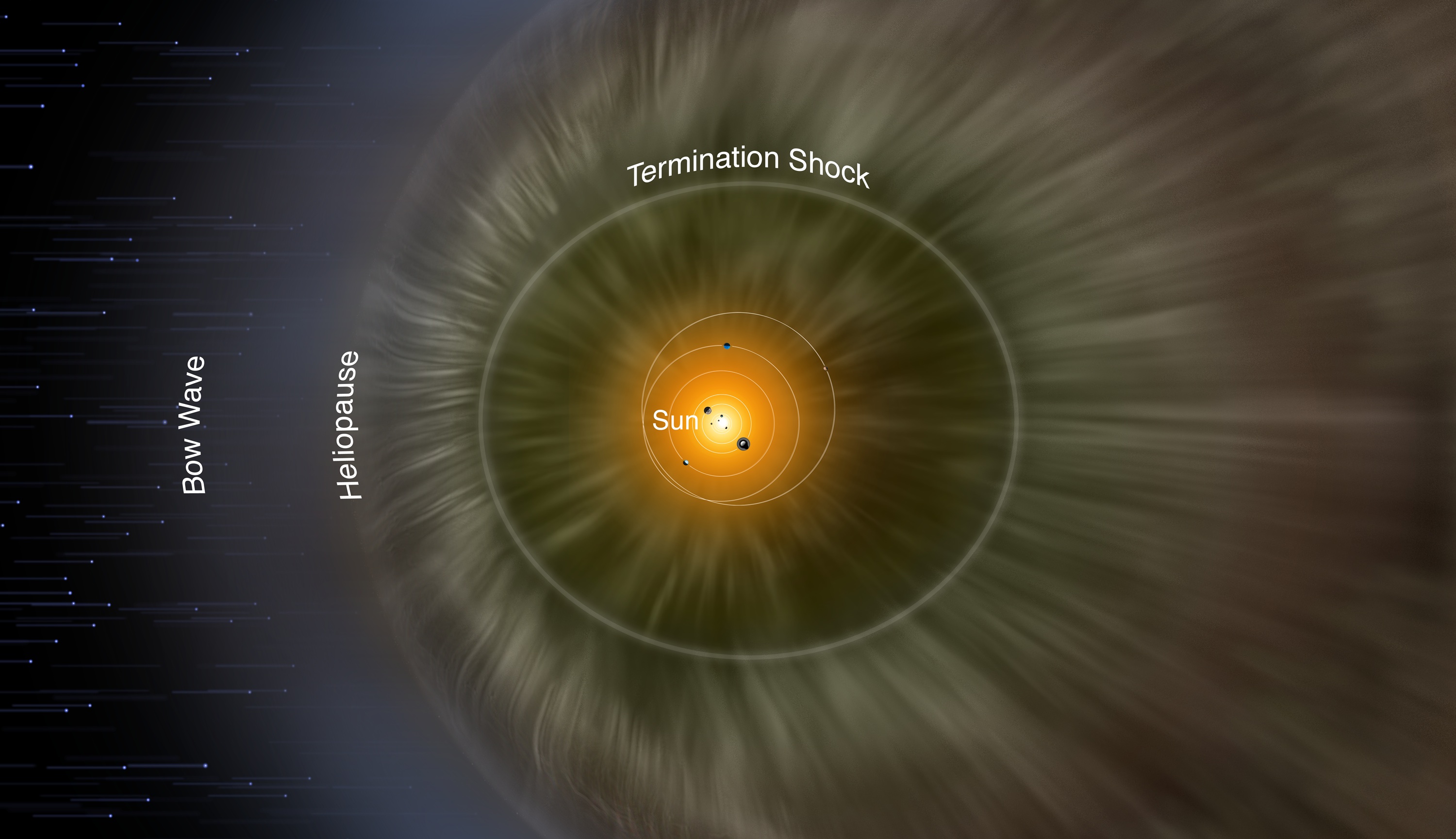
This image shows the known distances and unknown distances between our heliosphere, the termination shock, heliopause and bow shock. The termination shock creates a sphere around our solar system. It is located about 100 AU (100 times the distance from the Earth to the Sun) away from the Sun. Solar wind particles begin to interact with the interstellar medium (ISM) here. The outward movement of the solar wind creates pressure, much as air filling a balloon creates pressure on the outside of the balloon, causing it to expand. The interstellar medium also has its own pressure of moving plasma. The point where the pressure of the solar wind is equal to the pressure of the interstellar medium hitting the solar wind is called the heliopause. A particle directly at the heliopause will feel equal pressure from both the solar wind and the interstellar medium. The outermost layer is called the bow shock. The bow shock is where the ISM first interacts with the solar wind. Beyond this layer all other ISM feels no electromagnetic forces from the solar wind.
Image Credit: SwRI/IBEX Team |
 |
This is a diagram that shows the different parts of the heliosphere. As the Sun moves through the interstellar medium, the material around it is "pushed" out of the way by the solar wind, which forms the heliosphere. Each part of the heliosphere has a different name, as indicated on the diagram: the bow shock, heliopause, heliosheath, termination shock, and the heliotail.
Image Credit: SwRI/IBEX Team |
 |
This picture is an artist’s drawing of the heliosphere. The three spherical shells in this image represent the termination shock, the heliopause, and the bow shock, starting from the center of the picture and moving outward. Our solar system is shown in the center of the image. The enlarged detail shows the IBEX spacecraft in orbit around the Earth.
Image Credit: SwRI/IBEX Team |
 |
This table describes how the four fundamental science questions will be answered on basic, interpretive, and understanding levels. Also, each question includes the measurement requirements that are necessary to accurately answer the questions; these are listed in the bottom two rows.
Image Credit: SwRI/IBEX Team |
 |
The graph at the top of the energy key shows the flux (material flowing through a square area) of Energetic Neutral Atoms (ENAs) that the IBEX–Hi and –Lo sensors might detect. There are three lines of expected ENA flux, one for strong Termination Shock (TS), one for weak TS, and one from Pre TS ENAs, or ENAs that do not come from the termination shock. The axis on the bottom of the diagram shows the energy one has if there is a certain flux. The bands underneath the graph illustrate what population of the ENAs is at a certain energy, which instrument operates at a certain energy and which questions are answered at a certain energy.
Image Credit: SwRI/IBEX Team |
 |
This is a technical drawing of the Pegasus rocket that will launch the spacecraft into space.
Image Credit: SwRI/IBEX Team |
 |
This is the launch vehicle. This is the device that will take the spacecraft away from the surface of the Earth.
Image Credit: SwRI/IBEX Team |
 |
The solid rocket motor is attached to the launch vehicle and brings the spacecraft to an orbit around the Earth at 50 times the Earth’s radius.
Image Credit: SwRI/IBEX Team |
 |
This is a side view of the hexagonal structure of the spacecraft. The IBEX–Lo sensor is situated at the top of the hexagon and the IBEX–Hi sensor is situated at the bottom. When the spacecraft is at the point in its orbit farthest from Earth it will fire its rockets in order to obtain the necessary orbit. This is called raising perigee. After this final burn, the spacecraft will be ready to perform its science mission.
Image Credit: SwRI/IBEX Team |
 |
This image shows the inner construction of the two sensors, IBEX–Lo and IBEX–Hi. The energy bands" describe what energies of the Energetic Neutral Atoms the sensors accept. IBEX–Lo can measure particles with 0.01–2 keV (one-thousand electron volts) of energy and IBEX–Hi can measure particles with 0.3–6 keV of energy.
Image Credit: SwRI/IBEX Team |
 |
An intricate drawing of the inner workings of IBEX–Hi and IBEX–Lo.
Image Credit: SwRI/IBEX Team |
 |
This is an example of a Pegasus rocket launching. It is similar to the rocket that will be used to launch IBEX.
Image Credit: Orbital Sciences Corporation |
 |
This is an example of a Pegasus rocket launching from an airplane. It is similar to the one that will be used to launch IBEX. The Pegasus rocket was taken to high altitude by an L–1011 plane, released, and fired its own rockets to propel it into space.
Image Credit: Orbital Sciences Corporation |
 |
This image shows the five steps that are required to take the IBEX spacecraft into its orbit. First the rocket is launched from the Earth. The rockets fire again to achieve the blue orbit. After the second engine burn, the rocket separates from the spacecraft, leaving it alone in space. Then the rocket fires again, putting the satellite on the red orbital track. After this the spacecraft is in the red orbit.
Image Credit: SwRI/IBEX Team |
 |
An artist’s conception of the IBEX spacecraft in orbit around Earth.
Image Credit: SwRI/IBEX Team |
 |
This is a composite image of the IBEX spacecraft, its orbit in the heliosphere, and models of predicted results. The solar system sits in the center of three spherical shells, each one representing a layer of the heliosphere. Within the solar system the Earth orbits the Sun, and the spacecraft orbits Earth. The hexagonal, blue and yellow figure is the spacecraft, which scans the heliosphere as it orbits the Earth. The two cones emanating from the top and bottom of the spacecraft show the sensors’ field of view. The two ellipses in outlined in the white box illustrate what two models of the IBEX data from the heliosphere may look like. The models are a type of map of the sky, similar to a map of the Earth made flat and in the shape of an oval. These maps show the number of Energetic Neutral Atoms (ENAs) for each small area of the sky. The direction that the Sun is traveling, the nose of the heliosphere, is shown towards the right center of each map. Red represents high levels of the number of ENAs emitted in that region, blue represents low numbers of ENAs emitted in that region. The top map shows what the data would look like if there was a strong shock, which means that the solar wind speed rapidly decreases in that area. The other map shows what the data would look like if there was a weak shock. In this case the initial shock is weakened into a wave by pickup ions and energetic protons from the solar wind. If the Termination Shock (TS) is strong then the front of the shock (like the front of the wake of boat) will have many ENAs originating there due to a lot of activity, and lesser ENA origination in the tail. If the TS is weak then the front of the shock will have few ENAs and the tail will have a more complicated pattern.
Image Credit: SwRI/IBEX Team |
 |
These images depict two models of the IBEX data. The models are a type of map of the sky, similar to a flattened, oval map of the Earth you may have seen. These maps show the number of Energetic Neutral Atoms (ENAs) for each small area of the sky. The direction that the Sun is traveling, the nose of the heliosphere, is shown towards the right center of each map. Regions in red indicate that high levels of ENA originated in the region, while blue regions indicate low levels of ENA originated in the region. The top map shows what the data would look like if there was a strong shock, which means that the solar wind carries most of the pressure. The other map shows what the data would look like if there was a weak shock. In the case of weak shock, the initial shock is weakened into a wave by pickup ions and energetic protons from the solar wind. The top ellipse shows that if the TS is strong, the nose of the heliosphere will have high ENA origination while the tail will have relatively little ENA origination. Conversely, weak TS will have low numbers of ENAs at the nose. However, as one approaches the tail of a weak TS, ENA counts soar to form a peak circling the tail, yet the numbers of ENA will drop off quickly so that the tail itself has low ENA origination. The TS is most likely a combination of both models.
Image Credit: SwRI/IBEX Team |
 |
The top box is a simplified drawing of the interstellar wind moving from right to left and interacting with the solar wind. The left–hand side of the illustration shows the interstellar medium (ISM) continuing its flow around the Sun and reconnecting on the other side. The two arrows flowing with the ISM represent oxygen in the ISM. For example, Oxygen easily interacts with Hydrogen and can make water. If Oxygen interacts with Hydrogen the Oxygen loses energy, whereas Oxygen alone has a higher energy. The undisturbed Oxygen, or primary population, is shown by the blue arrow. The secondary Oxygen population that has interacted with Hydrogen is shown by the red arrow.
As the two different populations of Oxygen flow, the population with the greatest velocity will be pulled less then the population with a smaller velocity. The primary population is not pulled as much as the secondary population, making the reconnection point of the primary population farther from the Sun than that of the secondary population. The sensors on the spacecraft will be the first to directly measure these different populations of Oxygen in the ISM.
As the two different populations of Oxygen flow, the population with the greatest velocity will be pulled less by the Sun's gravity than the population with a lesser velocity. The primary population is not pulled as much as the secondary population, making the reconnection point of the primary population farther from the Sun than that of the secondary population. The sensors on the spacecraft will be the first to directly measure these different populations of Oxygen in the ISM.
The two graphs beneath the illustration show how many oxygen particles per area (flux) can be found at certain angles away from the Sun and are expected to enter the detector. The combined fluxes of the primary and secondary population are added together to create the green line.
Image Credit: SwRI/IBEX Team |
 |
This diagram shows the potential orbit of the IBEX spacecraft. The spacecraft's axis of rotation is always toward the Sun so the sensors located on the side of the spacecraft never point at the Sun. Both sensors, IBEX–Lo and IBEX–Hi have a field of view (FOV) of 7 degrees. As the spacecraft orbits Earth, the Earth also orbits the Sun, as shown on the left. The blue trail pointing away from the Sun behind the Earth is the Earth’s magnetosphere, which can interfere with sensors’ data collection. The spacecraft is only influenced by the Earth’s magnetosphere part of the time, and therefore scientists are most interested in the data collected outside the magnetosphere.
Image Credit: SwRI/IBEX Team |
 |
As the Earth orbits the Sun, the spacecraft orbits the Earth. Like the Sun, the Earth generates a magnetic field that influences a region around the Earth. This area of influence is called the magnetosphere and Earth’s magnetosphere is represented by the blue hyperbola. Earth’s magnetosphere produces its own Energetic Neutral Atoms (ENAs), which the spacecraft may detect while inside the magnetosphere. Data taken by the spacecraft outside of the Earth’s magnetosphere has the greatest chance of being ENAs from the Termination Shock and not from the Earth’s magnetosphere.
Image Credit: SwRI/IBEX Team |
 |
|
|